NavbarUsing Bootstrap to Implement a Navbar
In this deets, I will explain the concept of a navigation bar, or “Navbar”, and how to use a Bootstrap or Bootswatch template to add a Navbar to an app.
What is a Navbar?
A Navbar is a user interface element within a webpage that contains links to other sections of the website. In most cases, the navigation bar is part of the main website template (app/views/layouts/application.html.erb in Rails), which means it is displayed on most, if not all, of the pages within the website. It will usually be the first element in the HTML body element and sit outside of the main content container element. The Navbar will consist of a nav element.
nav Element vs. Navbar
HTML provides a tag called <nav> that is meant to be used for a collection of links. This could be a table of contents, a table, or an index, for example. The collection could be rendered with a vertical orientation or a horizontal orientation. Bootstrap helped to standardize the concept of the Navbar as a responsive horizontal frame at the top of a webpage containing links and other simple, relevant functions, e.g., a search bar. Since then, this has become one of the most popular ways of navigating a website.
The Bootstrap Navbar
To show the different parts of a Bootstrap Navbar, we will use one of the Bootswatch Pulse themed navbars as an example, shown in Figure 1.

Figure 1. Bootswatch’s Pulse navbar.
This is the code for the Navbar in Figure 1:
1 | <nav class="navbar navbar-expand-lg navbar-dark bg-primary"> |
2 | <div class="container-fluid"> |
3 | |
4 | <a class="navbar-brand" href="#">Navbar</a> |
5 | |
6 | <button class="navbar-toggler" type="button" |
7 | data-bs-toggle="collapse" |
8 | data-bs-target="#navbarColor01" |
9 | aria-controls="navbarColor01" |
10 | aria-expanded="false" |
11 | aria-label="Toggle navigation"> |
12 | <span class="navbar-toggler-icon"></span> |
13 | </button> |
14 | |
15 | <div class="collapse navbar-collapse" |
16 | id="navbarColor01"> |
17 | |
18 | <ul class="navbar-nav me-auto"> |
19 | <li class="nav-item"> |
20 | <a class="nav-link active" |
21 | href="#">Home |
22 | <span class="visually-hidden">(current)</span> |
23 | </a> |
24 | </li> |
25 | <li class="nav-item"> |
26 | <a class="nav-link" href="#">Features</a> |
27 | </li> |
28 | <li class="nav-item"> |
29 | <a class="nav-link" href="#">Pricing</a> |
30 | </li> |
31 | <li class="nav-item"> |
32 | <a class="nav-link" href="#">About</a> |
33 | </li> |
34 | <li class="nav-item dropdown"> |
35 | <a class="nav-link dropdown-toggle" |
36 | data-bs-toggle="dropdown" href="#" |
37 | role="button" |
38 | aria-haspopup="true" |
39 | aria-expanded="false">Dropdown</a> |
40 | <div class="dropdown-menu"> |
41 | <a class="dropdown-item" href="#">Action</a> |
42 | <a class="dropdown-item" |
43 | href="#">Another action</a> |
44 | <a class="dropdown-item" |
45 | href="#">Something else here</a> |
46 | <div class="dropdown-divider"></div> |
47 | <a class="dropdown-item" |
48 | href="#">Separated link</a> |
49 | </div> |
50 | </li> |
51 | </ul> |
52 | |
53 | <form class="d-flex"> |
54 | <input class="form-control me-sm-2" type="text" |
55 | placeholder="Search"> |
56 | <button class="btn btn-secondary my-2 my-sm-0" |
57 | type="submit">Search</button> |
58 | </form> |
59 | |
60 | </div> |
61 | |
62 | </div> |
63 | </nav> |
It has a lot of pieces, so let’s break it down into its major components.
Outer Layout and Theme Wrappers
These HTML tags will surround all content in the Navbar and control the overall look and layout of the Navbar.
nav Element
The outer tag of the Navbar is the <nav> tag that we talked about previously.
1 | <nav class="navbar navbar-expand-lg navbar-dark bg-primary"> |
2 | |
3 | ... |
4 | |
5 | </nav> |
The Bootstrap classes .navbar-dark and .bg-primary control the background color and text color of the Navbar content. The .navbar-expand-lg class controls link visibility based on responsive breakpoints.
Responsive Bootstrap container
Immediately inside the nav element is a div element with the Bootstrap responsive .container-fluid class style, which allows the content of the element to shrink horizontally when the browser is resized.
1 | <nav class="navbar navbar-expand-lg navbar-dark bg-primary"> |
2 | <div class="container-fluid"> |
3 | |
4 | ... |
5 | |
6 | </div> |
7 | </nav> |
Collapsable Layout
Inside the wrapper elements, there are 2 main Navbar components: the website brand and the collapsable content.
Website Brand
This could contain the title of the website or the company’s logo or name. It is always visible and is typically positioned as the left-most element in the Navbar.
1 | <nav class="navbar navbar-expand-lg navbar-dark bg-primary"> |
2 | <div class="container-fluid"> |
3 | |
4 | <a class="navbar-brand" href="#">Navbar</a> |
5 | |
6 | ... |
7 | |
8 | </div> |
9 | </nav> |
Collapsable Content with Hamburger Button
When the browser is made small enough, all the previously visible links disappear, and a button with 3 horizontal lines (like a hamburger) appears on the right side of the Navbar like in Figure 2.

Figure 2. Bootswatch’s Pulse navbar with collapsed hamburger menu.
If you click on the button, you will see all the previously hidden links appear in a vertical list positioned beneath the Navbar like in Figure 3.
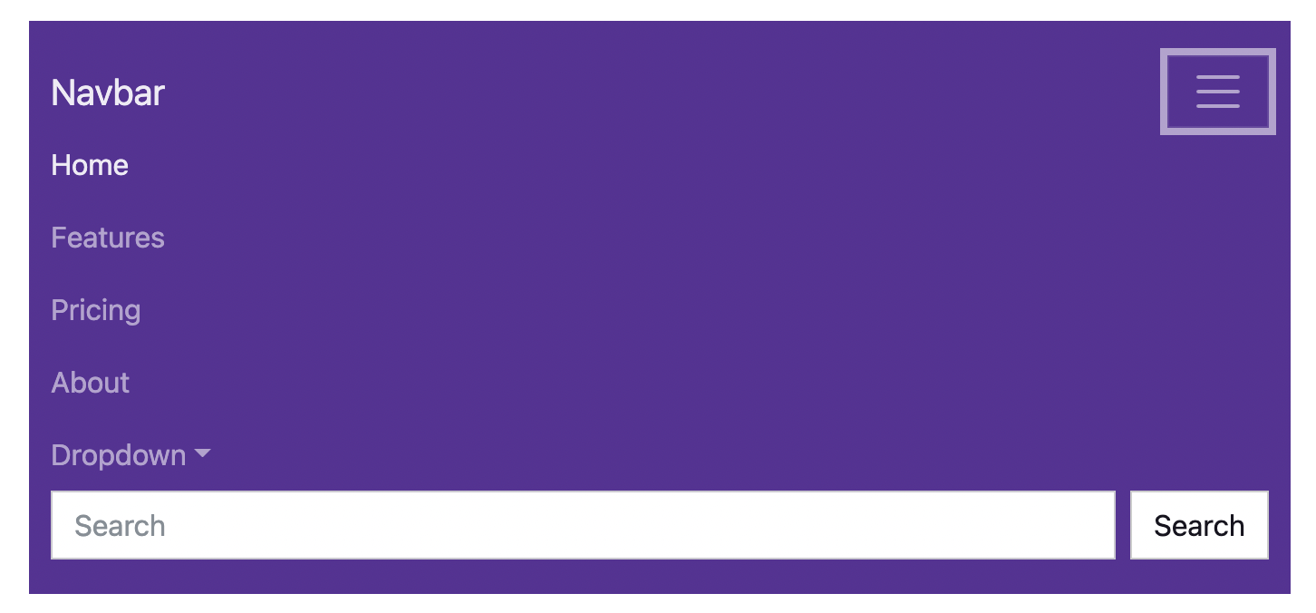
Figure 3. Bootswatch’s Pulse navbar with expanded hamburger menu.
If you click the humburger button again while the list is open, the vertical list will disappear.
The two elements that work together to provide this functionality are a button element with the Bootstrap .navbar-toggler class and a div element with the Bootstrap .collapse and .navbar-collapse classes like this:
1 | <nav class="navbar navbar-expand-lg navbar-dark bg-primary"> |
2 | <div class="container-fluid"> |
3 | |
4 | <a class="navbar-brand" href="#">Navbar</a> |
5 | |
6 | <button class="navbar-toggler" type="button" |
7 | data-bs-toggle="collapse" |
8 | data-bs-target="#navbarColor01" |
9 | aria-controls="navbarColor01" |
10 | aria-expanded="false" |
11 | aria-label="Toggle navigation"> |
12 | <span class="navbar-toggler-icon"></span> |
13 | </button> |
14 | |
15 | <div class="collapse navbar-collapse" |
16 | id="navbarColor01"> |
17 | |
18 | ... |
19 | |
20 | </div> |
21 | |
22 | </div> |
23 | </nav> |
To make the collapse/expand functionality work, the <button> tag has specified data-bs-toggle and data-bs-target options. These are called HTML data-* attributes and are typically set to allow JavaScript functions to find, read, or change the element’s attribute values via DOM modification. In this case, the bs-toggle (Bootstrap toggle) data attribute tells the Bootstrap JavaScript that clicking on the button should apply additional Bootstrap classes to both elements which will toggle visibility between the collapsed and expanded states.
Likewise the bs-target (Bootstrap target) data attribute indicates which div element should be collapsed and expanded. In this case, the bs-target attribute value is #navbarColor01, which will match an element with an id attribute (indicated by the #) containing the value navbarColor01. You can see the div with the .navbar-collapse class does have the indicated id attribute value.
Important! The div element with all the content you want to collapse must have the class or id attribute value specified in the button element’s bs-target data attribute in order for the toggle functionality to work.
Navigation Content
All the links in the navbar belong in the <div> container that has class="collapse navbar-collapse", as we discussed before.
1 | <nav class="navbar navbar-expand-lg navbar-dark bg-primary"> |
2 | <div class="container-fluid"> |
3 | |
4 | ... |
5 | |
6 | <div class="collapse navbar-collapse" |
7 | id="navbarColor01"> |
8 | |
9 | <ul class="navbar-nav me-auto"> |
10 | <li class="nav-item"> |
11 | <a class="nav-link active" |
12 | href="#">Home |
13 | <span class="visually-hidden">(current)</span> |
14 | </a> |
15 | </li> |
16 | <li class="nav-item"> |
17 | <a class="nav-link" href="#">Features</a> |
18 | </li> |
19 | <li class="nav-item"> |
20 | <a class="nav-link" href="#">Pricing</a> |
21 | </li> |
22 | <li class="nav-item"> |
23 | <a class="nav-link" href="#">About</a> |
24 | </li> |
25 | <li class="nav-item dropdown"> |
26 | <a class="nav-link dropdown-toggle" |
27 | data-bs-toggle="dropdown" |
28 | href="#" role="button" |
29 | aria-haspopup="true" |
30 | aria-expanded="false">Dropdown</a> |
31 | <div class="dropdown-menu"> |
32 | <a class="dropdown-item" href="#">Action</a> |
33 | <a class="dropdown-item" |
34 | href="#">Another action</a> |
35 | <a class="dropdown-item" |
36 | href="#">Something else here</a> |
37 | <div class="dropdown-divider"></div> |
38 | <a class="dropdown-item" |
39 | href="#">Separated link</a> |
40 | </div> |
41 | </li> |
42 | </ul> |
43 | |
44 | <form class="d-flex"> |
45 | <input class="form-control me-sm-2" type="text" |
46 | placeholder="Search"> |
47 | <button class="btn btn-secondary my-2 my-sm-0" |
48 | type="submit">Search</button> |
49 | </form> |
50 | |
51 | </div> |
52 | |
53 | </div> |
54 | </nav> |
Links
Within the main content <div>, the first thing we see is an unordered list (<ul>), with the class “navbar-nav”. This implies that every link we see in the navbar should be an item in this list (<li>). Those links will have the class “nav-item”. Each <li> contains the anchor tag (<a>) for the link. We can pull out the following example from the above code:
1 | ... |
2 | |
3 | <ul class="navbar-nav me-auto"> |
4 | |
5 | ... |
6 | |
7 | <li class="nav-item"> |
8 | <a class="nav-link" href="#">Features</a> |
9 | </li> |
10 | |
11 | ... |
12 | |
13 | </ul> |
14 | |
15 | ... |
Note that the <ul> tag also has the class “me-auto” which aligns all the links inside the list to the left of the navbar.
A variation of this kind of link is an “active link”, which is highlighted to show that this is the currently shown page. This is achieved by adding the CSS class “active” to the <a> tag that contains the link. For example, consider the first link in the above navbar.
1 | ... |
2 | |
3 | <li class="nav-item"> |
4 | <a class="nav-link active" |
5 | href="#">Home |
6 | <span class="visually-hidden">(current)</span> |
7 | </a> |
8 | </li> |
9 | |
10 | ... |
The <span> with the class “visually-hidden” is an accessibility addition visible only to screen readers to indicate that the active link is the current page since the highlighting may not be apparent to a screen reader.
Drop-Down List
In addition to singular text links, another variation is a drop-down list of links. This is a button that expands a <div> when clicked, similar to the hamburger that we discussed before. The primary difference is that its data-bs-toggle option is set to “dropdown”.
1 | ... |
2 | |
3 | <li class="nav-item dropdown"> |
4 | <a class="nav-link dropdown-toggle" |
5 | data-bs-toggle="dropdown" |
6 | href="#" role="button" |
7 | aria-haspopup="true" |
8 | aria-expanded="false">Dropdown</a> |
9 | <div class="dropdown-menu"> |
10 | <a class="dropdown-item" href="#">Action</a> |
11 | <a class="dropdown-item" |
12 | href="#">Another action</a> |
13 | <a class="dropdown-item" |
14 | href="#">Something else here</a> |
15 | <div class="dropdown-divider"></div> |
16 | <a class="dropdown-item" |
17 | href="#">Separated link</a> |
18 | </div> |
19 | </li> |
20 | |
21 | ... |
Search Bar
The final element of this example navbar is a search bar form:
1 | ... |
2 | |
3 | <form class="d-flex"> |
4 | <input class="form-control me-sm-2" type="text" |
5 | placeholder="Search"> |
6 | <button class="btn btn-secondary my-2 my-sm-0" |
7 | type="submit">Search</button> |
8 | </form> |
9 | |
10 | ... |
Note that the form is outside of the <ul> that contained the class “me-auto” so it will align to the right side of the navbar instead of the left.
Adding a Navbar to a Rails Project
When we add a Bootstrap navbar to a Rails project there are a couple of changes we need to make to the template. To illustrate these changes, we’ll use the example of the Quiz-Me navbar displayed in Figure 4.

Figure 4. The navbar for the Quiz-Me App containing home, sign-in, and sign-up links.
We can use one of the Bootstrap navbar templates with a couple changes to make it Rails-compatible. First, all of the links should be changed to use the link_to helper provided by Ruby on Rails. For example, this is the code for the home link:
Second, the active CSS class should not be hardcoded to a single link. Instead, every link should use a custom function we wrote that gets the current page from the Rails server to assign the class dynamically. We can add the following function to helpers/application_helper.rb.
1 | def active_class(path) |
2 | if request.path == path |
3 | 'active' |
4 | else |
5 | '' |
6 | end |
7 | end |
The active class helper will retrieve the path from the currently active server request and compare it against the path helper for a given link. If they match, it will return the string "active", otherwise it will return an empty string. We use string interpolation to place the return value directly into the rendered HTML like this:
1 | <li class="nav-item"> |
2 | <%= link_to 'Home', quizzes_path, class: "nav-link #{active_class(quizzes_path)}" %> |
3 | </li> |
Here is the full code for the Quiz-Me App navbar after making the changes. We would place this code in app/views/layout/application.html.erb as the first element inside the <body> tags.
1 | <nav class="navbar navbar-expand-lg navbar-light bg-light"> |
2 | <div class="container-fluid"> |
3 | |
4 | <a class="navbar-brand" href="#">Quizzes</a> |
5 | |
6 | <button class="navbar-toggler" type="button" |
7 | data-bs-toggle="collapse" |
8 | data-bs-target="#navbarSupportedContent" |
9 | aria-controls="navbarSupportedContent" |
10 | aria-expanded="false" |
11 | aria-label="Toggle navigation"> |
12 | <span class="navbar-toggler-icon"></span> |
13 | </button> |
14 | |
15 | <div class="collapse navbar-collapse" |
16 | id="navbarSupportedContent"> |
17 | |
18 | <ul class="navbar-nav me-auto"> |
19 | <li class="nav-item"> |
20 | <%= link_to 'Home', quizzes_path, |
21 | class: "nav-link #{active_class(quizzes_path)}" %> |
22 | </li> |
23 | </ul> |
24 | |
25 | <ul class="navbar-nav"> |
26 | <% if user_signed_in? %> |
27 | <li class="nav-item"> |
28 | <%= link_to "Hi, #{current_user.email}", edit_user_registration_path, |
29 | class: "nav-link #{active_class(edit_user_registration_path)}" %> |
30 | </li> |
31 | <li class="nav-item"> |
32 | <%= link_to 'Sign Out', destroy_user_session_path, |
33 | method: :delete, class: "nav-link" %> |
34 | </li> |
35 | <% else %> |
36 | <li class="nav-item"> |
37 | <%= link_to 'Sign In', new_user_session_path, |
38 | class: "nav-link #{active_class(new_user_session_path)}" %> |
39 | </li> |
40 | <li class="nav-item"> |
41 | <%= link_to 'Sign Up', new_user_registration_path, |
42 | class: "nav-link #{active_class(new_user_registration_path)}" %> |
43 | </li> |
44 | <% end %> |
45 | </ul> |
46 | |
47 | </div> |
48 | |
49 | </div> |
50 | </nav> |
Note that instead of a search bar, the Quiz-Me navbar contains a second group of links that aligns to the right side of the navbar for our Devise links.
Further Reading
Bootstrap’s documentation for the navbar component can be found here.